Introduction: If you are new to web design, positioning elements on a page can feel like a nightmare. You’ve likely heard of Flexbox and CSS Grid. While they might seem similar, they serve very different purposes.
The Breakdown:
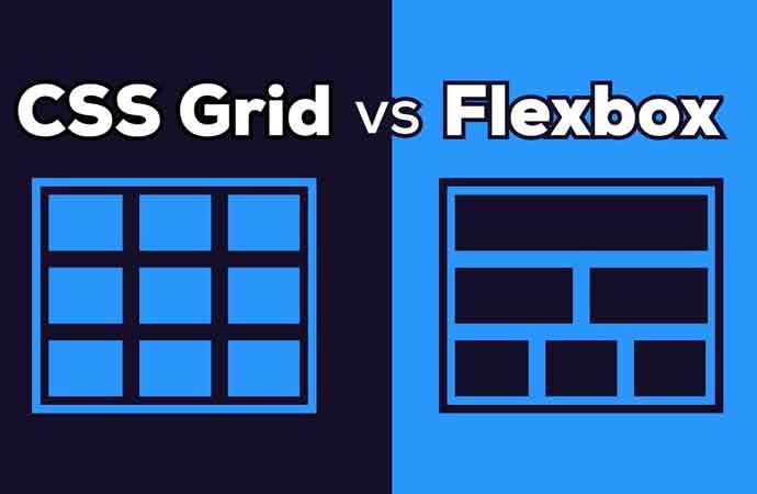
- Flexbox (One-Dimensional): Best for aligning items in a single row or a single column. Think of a navigation bar or a centered button. It’s all about the “content.”
- CSS Grid (Two-Dimensional): Best for complex layouts involving both rows and columns. Think of a full-page layout or a photo gallery. It’s all about the “container.”
Quick Tip: If you need to align items in a straight line, use Flexbox. If you want to build a whole website skeleton, use Grid.